My first isometric project with vysvetli.cz.
My first isometric project with vysvetli.cz.
Another fragment from isometric video for vysvetli.cz. Transition between the scenes is always a challenge, twice as much in isometric view.
Illustration exploration
Another chill animation I've worked up recently.
You can check out how I created this animation here:
https://www.youtube.com/watch?v=1mcv5Jyx87Y
No customers in this ghost town!
Africa Double Exposure Design
Siri analyzes the context of conversations to offer relevant recommendations. Interaction with your phone becomes easier than ever before.
More on Behance: https://www.behance.net/gallery/80838685/iOS-13-concept
Use case
I recently purchased a frame from Lenskart app. Lenskart has built a 3D Ditto feature to simulate specs on user's face. It's a really good feature to bridge the gap between online and offline spec purchasing. After using it I realised, This feature is a little painful to use.
Usability pain points found in 3D Ditto
1. Bad camera and lighting.
2. Setting Face Position: Difficult for the user to hold their phone at a position. It also takes a lot of time to finalise position.
3. Creating 3D Ditto:
a) When the user turns his head to left and right their eyesight goes off the screen and they don't get to know they still need to turn their face at the centre.
b) User tries to keep their face into the frame but it's very difficult to match with the same moving speed of frame.
4. Users get too lost in creating a perfect 3D ditto, They end up giving serious expressions which don't look good.
5. Comparing 3D Ditto with Product Images: User loses their self-esteem when they compare themselves with the model wearing the frame. It happens because of bad lighting, blur image, improper frame fitting and bad expressions on their face.
Design Solution
Try to imagine what people do when they go to buy Specs physically on a store.
They make a lot of facial expressions when they wear specs and look at the mirror to ensure that they are looking good in almost every expression.
Instagram camera filter does the exact same thing. I’ve used it as a simulator which takes very fewer efforts and looks like you are buying specs physically in the virtual world.
I've attached all screenshots with all pain points also. PFA for the same.
Hope you like it!
Please feel free to give your feedback :)
Hi folks! Here's my animation project "Biggest Summer MeetUp" It will help you to create trendy animation promo for any corporate event, workshop, conference.
https://videohive.net/item/biggest-meetup-event-promo/23924842
在孩子的世界里,总可以轻松做到笑口常开。
Interaction for a Fashion and Lifestyle Platform Exclusively for Men.
What you think guys?
---
Show some love! Press "L".
Want to see more projects? Visit my profile and remember to follow me!
“The phone is our gun.” Read the story here to understand "WHY?" https://codastory.com/authoritarian-tech/myanmar-facebook-conflict-rakhine/ My GIF for this article by @CodaStory. And one unpublished illustration for the same story on my @Behance page https://www.behance.net/gallery/80160013/Cyber-war-in-Myanmar
Daily UI Challenge 001
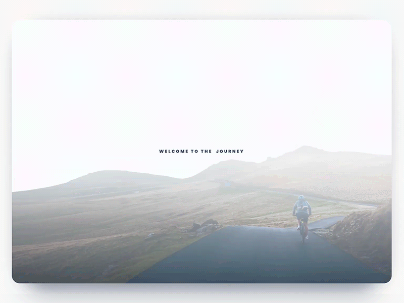
Let me introduce my first shot on this platform for which I was inspired during the journey. A website design concept in a minimalist style, presenting a cycling trip in four countries.
Careful attention was paid to typography and composition, as key sides of user-friendly minimalism enhancing usability, navigability, and visual harmony transferring the spirit of the presented place.
The animation shows transitions between the preload page, the homepage, and the menu to give the feeling of the general design represent.
The accent color has a tone of living coral with a golden undertone, which is the color of 2019 according to experts of the Pantone color institute.
In the following shots, I'll show the rest of the site’s pages and animated transitions between them.
Idea for animating search bar micro interaction for digital platforms.